


The dark side of Flexbox - how I spent three days debugging `display: flex;`.


Flexboxes are everywhere nowadays - from complex layouts that are difficult to implement with traditional float and positioning features of CSS to dead simple ones that don't need anything other than display: block; coupled with some other simple properties. Unfortunately, everyone wants to use them to feel like a CSS pro, introducing them to code when unneeded. For example, you probably know how commonly used the following snippet is.
.some-selector {
  display: flex;
  justify-content: center;
  align-items: center;
}
Do you want to centre some stuff horizontally, vertically, or both? Just add this to its parent, and the magic happens. But things are not as simple as that.
I have been like that for a while now, but recently, I got myself into trouble; by using display: flex; when I shouldn't have. I wanted this behaviour:
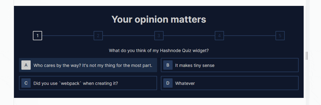
But I kept getting this:

I didn't figure out what was wrong until after three days, which is no joke. In this article, I'll explain in full detail what happened and how flexbox could sometimes be a disaster.
What I was working on
For weeks now, I've been working on improving my Hashnode blog. First, I bought a new domain and inserted some custom CSS to change its feel slightly. I then thought of what else to do to make the blog more unique, as almost all Hashnode blogs looked identical. Finally, I came up with the idea of creating a quiz widget solely to be used within it.
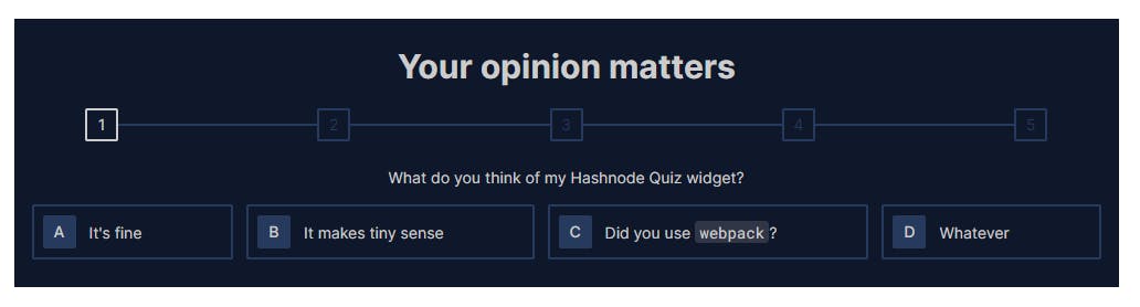
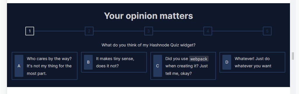
I wanted the widget to look as good as it could. It has to be able to keep readers engaged while reading my content. Because of this, I spent some time specifying how exactly I wanted each part to look. The following is an early prototype I created for it. (Maybe I shouldn't call it a prototype, as it was designed with HTML and CSS, but it is what it is).

The look I wanted
I specified that each option (answer choice) would take a minimum of 50% of the available width (excluding the gap between the options) and would continue to take the full width if that would cause its content to be wrapped. This would ensure that:
There is never more than two options side by side horizontally.
Each option will always have a width of either 50% or 100% of its container (excluding the gaps between them).
The options are rendered on at least two rows which makes sense for a list of question options. I don't want all the options to be on the same horizontal line if their contents are short.
The contents of each option won't be wrapped unnecessarily (when there is horizontal space that it can take).
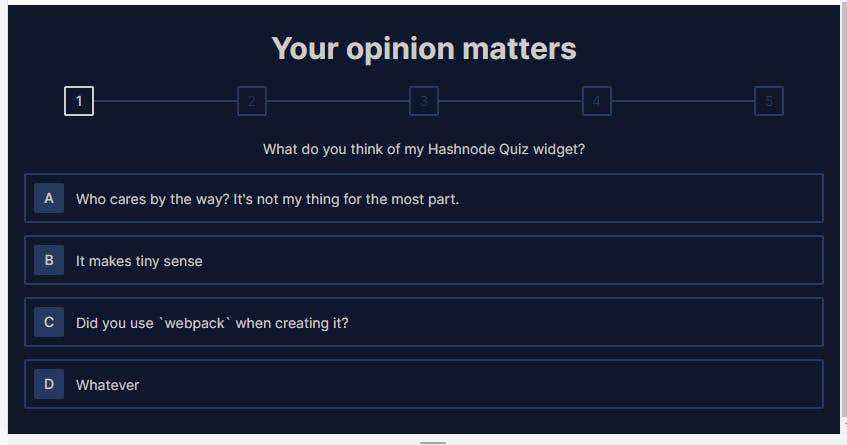
I didn't want a layout like this:
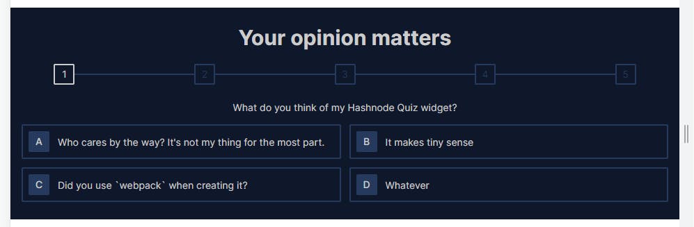
I wanted this:

Initially, in addition to making the widths of the options dynamic, I wanted their widths always to be the same. So each option would take a 50% width, and if the content of one of them can't fit into that without wrapping, all of them should take 100% width. I read several pages of the MDN docs and the CSS specification but couldn't make this happen. There are only two options that might satisfy this want without writing garbage CSS as far as I can say; CSS grid or CSS flexbox, both with their limitations, none of which I later implemented the design with at the end of the day.
Attempting to use CSS grid
You might want to check out this MDN page if you don't know about CSS grids, as I won't be talking about what they are extensively here.
If the options were laid out in a grid, I could not change their widths dynamically. Instead, I would have to define fixed tracks for the grid items (the options in this case), and the width required by the content of each option, which is supposed to determine whether the width of the option would be 50% or 100% would have no effect. For example, assuming there is a .options-container class set on the container of the four options, and I applied the following styles to it:
.options-container {
  display: grid;
  grid-template-columns: 1fr 1fr;
}
My requirements won't be met. The options will never take 100% of their container's width, regardless of whether their content is wrapping, as the value 1fr 1fr fixes their widths. On the other hand, I also can't use the following;
.options-container {
  display: grid;
  grid-template-columns: 1fr;
}
This also sets the width of the options to always be 100% of their parent's available content space, causing them to never take half the space, even if their content is small and doesn't require all the extra space. So, the requirements are still not met.
Setting the value of grid-template-columns either to 1fr or 1fr 1fr won't work for my purpose, although the latter value is a viable option if the contents of the options are fixed. I'll just set which tracks on the grid each option has to be contained in using properties like grid-row, grid-column, and the like, specifying how many columns each option has to span in the grid (if more than 1).
But the options don't have fixed contents. I'm creating the project using JSX (without React), and I'll develop quizzes for my Hashnode articles by calling a JavaScript API with the question and options for it. It's not that I'll be copying the same markup to create quizzes each time.
At this point, it's clear that setting fixed values for grid templates won't work. Something about the grid setup has to be dynamic if a grid will be the solution. For example, the options, which will be grid items, have to be able to dynamically set how many columns they need to span based on the space required by their content. If that were possible, I'd just set the value of grid-template-columns to 1fr 1fr, and if the content of an option (a grid item) requires more than half the available space, the option after if (if any) will be pushed to the next row and will take the full width. But as far as I know, this isn't possible now. If I set the minimum width of the grid items (the options) to max-content, they'll either overflow their container or have unequal width.
.options-container {
  display: grid;
  grid-template-columns: 1fr 1fr;
}

.option {
  min-width: max-content;
}

Since I want the options to always have the same width, it might also make sense to let the grid container dynamically lay the items in a single column spanning its full width, or two columns of equal width, depending on the content of the options. The following image demonstrates all options taking full width.
The grid container will lay the options out like this because the content of the first option cannot fit in half the space without wrapping. (Half the space is under the third progress number above the question.) Even though the content of options B and C can both fit in half the space, they'll still be laid out in full width because another option (A) requires it.
And on the other hand, if the contents of all the options can be contained in half the space, they'll be laid out in it.
The only grid solution that comes to mind is using grid-template-columns property with the repeat() function, the auto-fill keyword, and the minmax() function. But I tried several variants and didn't get it to work. The auto-fill allows for the dynamic creation of columns/rows in a grid container, and it is used with the repeat() function as a repeat count. It lets the container create as many tracks of the specified size (the second parameter passed to repeat()) as possible in the axis (column or row). For example, if I have the following HTML:
<div class="parent">
  <div class="child">I am a child element</div>
  <div class="child">I am a child element</div>
  <div class="child">I am a child element</div>
  <div class="child">I am a child element</div>
</div>
And the following CSS:
* {
  box-sizing: border-box;
}

.parent {
  width: 500px;
  margin: auto;
  display: grid;
  gap: 10px;
  grid-template-columns: repeat(auto-fill, 150px);
  outline: 5px solid green;
}

.child {
  outline: 2px solid brown;
}
(Note that outline doesn't affect the element's width or height, unlike border.)
Based on the line grid-template-columns: repeat(auto-fill, 150px); as many 150px as possible will be created in the grid container. Since I've set the width of the container to 500px, and the gap between tracks to 10px, auto-fill resolves to 3. As a result, three columns are created in the container.
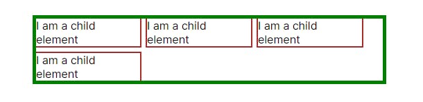
On each row in the grid container, a total of 470px (150px + 10px + 150px + 10px + 150px) will be taken, and 30px will be left unoccupied by any item. If I reduce the width of the container to a value like 400px , only two items will be on each row.
So, auto-fill might be a good fit for my purpose. But what would I pass it along with to the repeat() function? The repeat() function takes different kinds of values as its second argument. Which value will work here?
I need to reiterate what exactly I want here. I want the grid container to render items in either one or two columns, depending on their content. auto-fill is the only way to make that happen. Since I only want a single-column or a double-column grid, auto-fill must always resolve to a value of 1 or 2.
Before going on, you might want to learn about the minmax() function, which is also taken by the repeat() function takes as a second argument. minmax() takes two arguments*,* min and max, and according to MDN, it "defines a size range greater than or equal to min and less than or equal to max". The function is used exclusively with CSS grids, and it is used with the following properties:
grid-template-columnsgrid-template-rowsgrid-auto-columnsgrid-auto-rows
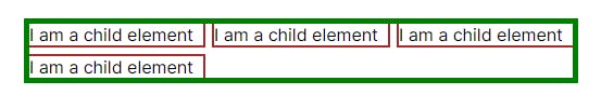
As a bonus (if you've just started learning about grids), when a value with the fr unit is passed to the minmax function, it sets the track's flex factor instead of its maximum width/height. For example, if I change the 150px in CSS above to minmax(150px, 1fr), the 30px remaining will be shared equally among the three columns since minmax() will set their flex factor to 1fr each.
grid-template-columns: repeat(auto-fill, minmax(150px, 1fr));
This results in the following:
I want each answer option to have a width of 50% of the available space (if that will contain its contents without wrapping) or 100% if not. Taking the .parent element above to be the grid container and its children as options (since there are four of them too), the following might seem like a solution:
.parent {
  --half-available-space: (100% - 10px) / 2; /* 10px is the gap */
  --min-required-width: max(var(--half-available-space), max-content);
  grid-template-columns: repeat(auto-fill, minmax(var(--min-required-width), 1fr));
}
But there are a lot of problems with this. First, max() doesn't take max-content as an argument. Even if it does, what would max-content mean in that context? When used with properties like width and min-width, max-content represents the amount of space the element's content needs to render without wrapping or overflowing. When used in a property like grid-template-columns on the other hand, max-content represents the highest of the spaces needed by elements to be contained in the track. For example, if I change the value of grid-template-columns above to the following:
grid-template-columns: max-content 1fr;
And I change the content of the third .child element to I am a child element with more content , the width of the first column will be the space needed to render this third child since the first and third children are rendered on the first column, and the third child is the one with more content.

So, max-content might not be meaning what I want it to mean in the code above (where it was used with max()).
Second, when the repeat count is auto-fill or auto-fit, the second argument to be passed to repeat() must be a <fixed-size> . Let me not get started on what that is. You can read more about it at the provided link. I might also write another article about that sometime later. Anyway, the above is not a solution. And if it isn't, there might be no grid solution for this problem. I don't know ☺. Do comment below if you know one.
Switching to flex
After spending several hours trying to implement the layout with grids, I decided to try it out with flex. But unlike grids, flexboxes are one-dimensional. That means it is impossible to make changes to a second row based on something that happened in the first row or vice-versa (assuming the `flex-direction` is row). Every row/column is independent. So, if I'll be using flexbox to implement my layout, there's no way for me to make all of the options have the same width as I described above unless they'll all be on the same row, which, of course, doesn't make sense.
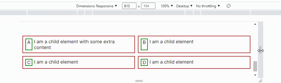
At this time, I dropped the requirement of all the options always having the same width and accepted to have a layout like this:
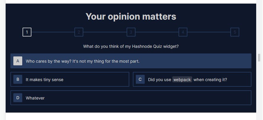
Some options (like A and D in the example above) can take full width, while others (like B and C above) take half the width, depending on their content.
How the problem surfaced
I'll use the following HTML code to explain what happened. It is a simplified version of my code but has every element needed. You can copy and load it in the browser if you want.
<div class="options-wrapper">
  <div class="option">
    <div class="letter">A</div>
    <div class="content">I am a child element with some extra content</div>
  </div>
  <div class="option">
    <div class="letter">B</div>
    <div class="content">I am a child element</div>
  </div>
  <div class="option">
    <div class="letter">C</div>
    <div class="content">I am a child element</div>
  </div>
  <div class="option">
    <div class="letter">D</div>
    <div class="content">I am a child element</div>
  </div>
</div>
This is not semantic, and you shouldn't use divs for interactive components. It's only for demonstration purposes.
There're four .option s, each containing a .letter and a .content . Also, a .options-wrapper wraps the .option s. To get the desired output, I laid out the .options as flex items by making .options-wrapper a flex container.
* {
  box-sizing: border-box;
}

.options-wrapper {
  display: flex;
  flex-wrap: wrap;
  gap: 10px;
}
If you don't know about flexboxes, you might want to read more about them on MDN. Properties like flex-basis, flex-shrink, and flex-grow are essential.
The next thing I did was add the following CSS.
.option {
  border: 2px solid brown;
  min-width: calc((100% - 10px) / 2);
  padding: 8px;
  flex-basis: max-content;
  flex-grow: 1;

  display: flex;
  gap: 6px;
}

.letter {
  flex-basis: 24px;
  flex-shrink: 0;
  text-align: center;
  outline: 2px solid green;
}
This sets the minimum width of each option to half the available horizontal space and the flex-grow: 1; part causes the options to take all available horizontal space if needed.
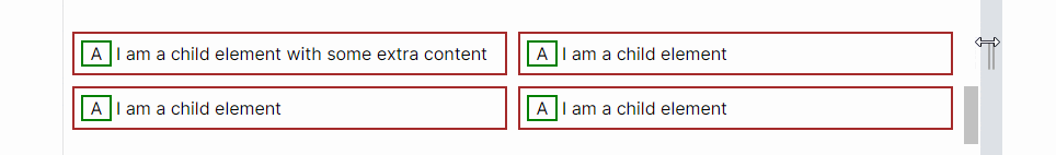
After applying this, I started to get the behaviour I mentioned earlier. At some point, instead of just directly taking the entire width of its parent, the first .option element wraps when its content is more than half the available width:
Can you spot the error? Try to find it before reading on. Right now, when I look at it, the error looks very obvious. It might be evident to you too. Maybe it's because of the other things involved in my actual project, making the error more difficult to find. But honestly, it took me about three days to point it out. I can't count how many times I visited the pages for the flex-* properties. I wrote the initial CSS on Tuesday and encountered the issue the same day. I woke up on Wednesday looking for the bug but couldn't figure it out, even after several hours of diving into Chrome dev tools and each property's details. It was the same on Thursday. It wasn't until after 01:00 pm on Friday that I discovered the problem's cause.
The line of CSS that reads flex-basis: max-content; and the one that reads flex-basis: 24px; caused the problem. The flex-basis property sets the initial main-size of a flex item. In this case, both .option and .letter elements are flex items. To make sure that the width of .option elements never gets less than the maximum size required by their contents, I set their flex-basis to max-content . This will cause them to take the entire width of their container if their content can't be contained in half the space.
This creates a dependency between .option elements and their children; the .letter and .content elements, which is fine in most cases. However, I also declared an flex-basis: 24px on .letter elements, which also causes them to depend on their parents for their width because if the parent of an element is not a flex container, setting flex-basis on the element will do nothing.
Since .option elements depend on their children for their width, all declarations on their children that depend on some value from them (like flex-basis: 24px; in this case) will not be considered when resolving a value like max-content. If they are considered, that could result in a never-ending loop. The parent will request a value from the child, the child will, in turn, request a value from the parent, the parent will request another value from the child again, and the child will then require a value from the parent, and that will continue.
The dependency constraints might not be apparent with an example like this. Let me give a more straightforward example. Given that we have a markup like this:
<div class="another">
  <div class="inner">Content is here in another, okay?</div>
</div>
And a stylesheet like this:
.another {
  margin: auto;
  width: max-content;
  border: 2px solid red;
}

.inner {
  width: 50%;
  border: 2px solid green;
  height: 30px;
}
What will the width of .another be? It depends on its content to determine its width since I've set width: max-content; on it. But I've also set width: 50%; on .inner , meaning that .inner also depends on its parent (.another) for its width. If both had to be resolved, it'd never be possible to determine the width of any of the two elements. So, one has to be ignored, and the one that will be ignored is the child (.inner). When resolving max-content, the width of .inner will be taken to be its max-content instead of the 50% I set. However, when .inner is rendered, it will take 50% of the width that was resolved as the max-content of .another .

Since .inner is the only child of .another, the width of .another is the max-content of .inner, but .inner only takes half that space because I've set its width to 50%. If I remove that, here is the result.
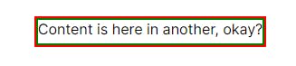
You can now see that the width of .another is the max-content of .inner.
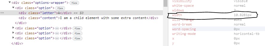
The same happened with .option and .letter above. When resolving max-content on .option, the flex-basis: 24px declaration on .letter will be ignored as it depends on .option to make any sense. The width of .letter will therefore be considered to taken to be its max-content . But when it is time for .letter to render, it takes 24px of the available space, which is greater than its max-content, causing the content of its sibling (.content) to be wrapped when there's not much space. To easily observe this, I'll change all the letters to be the same (A) so the max-content of all .letter s will be the same. For now, I'll also comment out the following line:
/* flex-basis: 24px; */
This is the result:

If I inspect any of the .letter in dev tools, and check for its computed width value, it is seen to be 10.8281px(space required to render the letter A):
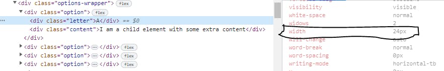
If I enable the line where I defined flex-basis: 24px; once again, the width of .letter becomes 24px, which is expected.
The first value (10.8281) is what is used to resolve max-content for .option, and not the 24px that it actually occupies in its container. If, for example, the max-content of the .content element in this diagram (the one in the first .option) is 500px, the max-content of .option will be 510.8281px (10.8281px + 500px) and that will be the value of its flex-basis, instead of 524px(24px + 500px) that would be expected. Remember the styles applied to it:
.option {
  border: 2px solid brown;
  min-width: calc((100% - 10px) / 2);
  padding: 8px;
  flex-basis: max-content;
  flex-grow: 1;

  display: flex;
  gap: 6px;
}
As a result, when the content of .option exceeds half the space, and it is supposed to take the entire width of its container, it won't immediately do that because the max-content value it has is 510.8281px even though the width required to render its content is actually 524px, and that's why we have this weird behaviour.
The content of .content is wrapped when the width of .option is between 524px and 510.8281. (Note that the actual width required to render I am a child with some extra content is not 500px, I just assumed that.)
The solution
The easiest way to solve this is to not use flex-basis and use width instead.
.letter {
  /* flex-basis: 24px; */
  width: 24px;
  flex-shrink: 0;
  text-align: center;
  outline: 2px solid green;
}
width doesn't depend on the containing element to make sense, so it is considered when resolving max-content for .option.
Another solution is to change .option not to be a flex container but instead a grid container. This way, max-content will also be appropriately resolved based on the specified grid tracks.
.option {
  border: 2px solid brown;
  min-width: calc((100% - 10px) / 2);
  padding: 8px;
  flex-basis: max-content;
  flex-grow: 1;

  /* display: flex; */
  gap: 6px;

  display: grid;
  grid-template-columns: 24px 1fr;
}

.letter {
  /* flex-basis: 24px; */
  text-align: center;
  outline: 2px solid green;
}

I settled for the second solution, although any of the two would do just fine.
Conclusion
This has been a very long one. I hope you enjoyed it. If you did, please like and share the article. You can also chat with me on Twitter @abdulramonjemil if you want. By the way, I'm looking for a writing job. Please, help with that if you've got some opportunity.
Thanks for reading...